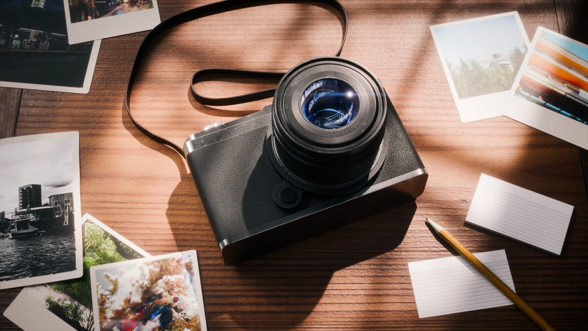
Over the course of a week, I challenged myself to improve my lighting skills in Blender by creating and rendering a simple camera model. Rather than focusing on complex modeling, this project was all about realistic lighting, reflections, compositing, and subtle color grading. Using both a clean studio setup and a natural tabletop scene, I explored how small lighting adjustments can completely transform the look and feel of a render.
Over the past week, I wanted to dedicate some time to improving my lighting skills in Blender. Rather than taking on a huge modelling project, To keep things simple, I built a basic camera model in a few hours to use as my test subject. My goal wasn't to achieve perfect topology or ultra-detailed modelling, but rather to learn how to create realistic, believable lighting.
To put this skill into practice, I created two scenes: one for clean product photography and one for a more natural tabletop setup. Throughout the project, I focused on how light interacts with different materials and how reflections and shadows help to define shapes, as well as how subtle compositing and color grading can bring a render together.
Keeping the Scope Small
One thing I wanted to avoid was getting lost in endless details. So I limited myself intentionally to a simple camera model with just a few materials: plastic, rubber, metal and glass. I also restricted the project to two scenes and set myself a one-week deadline.
This made it much easier to stay focused on what I actually wanted to practice. Rather than worrying about modelling tiny buttons or achieving perfect topology, I could experiment with lighting and observe how small changes affected the final image.
Scene 1 – Product Photography
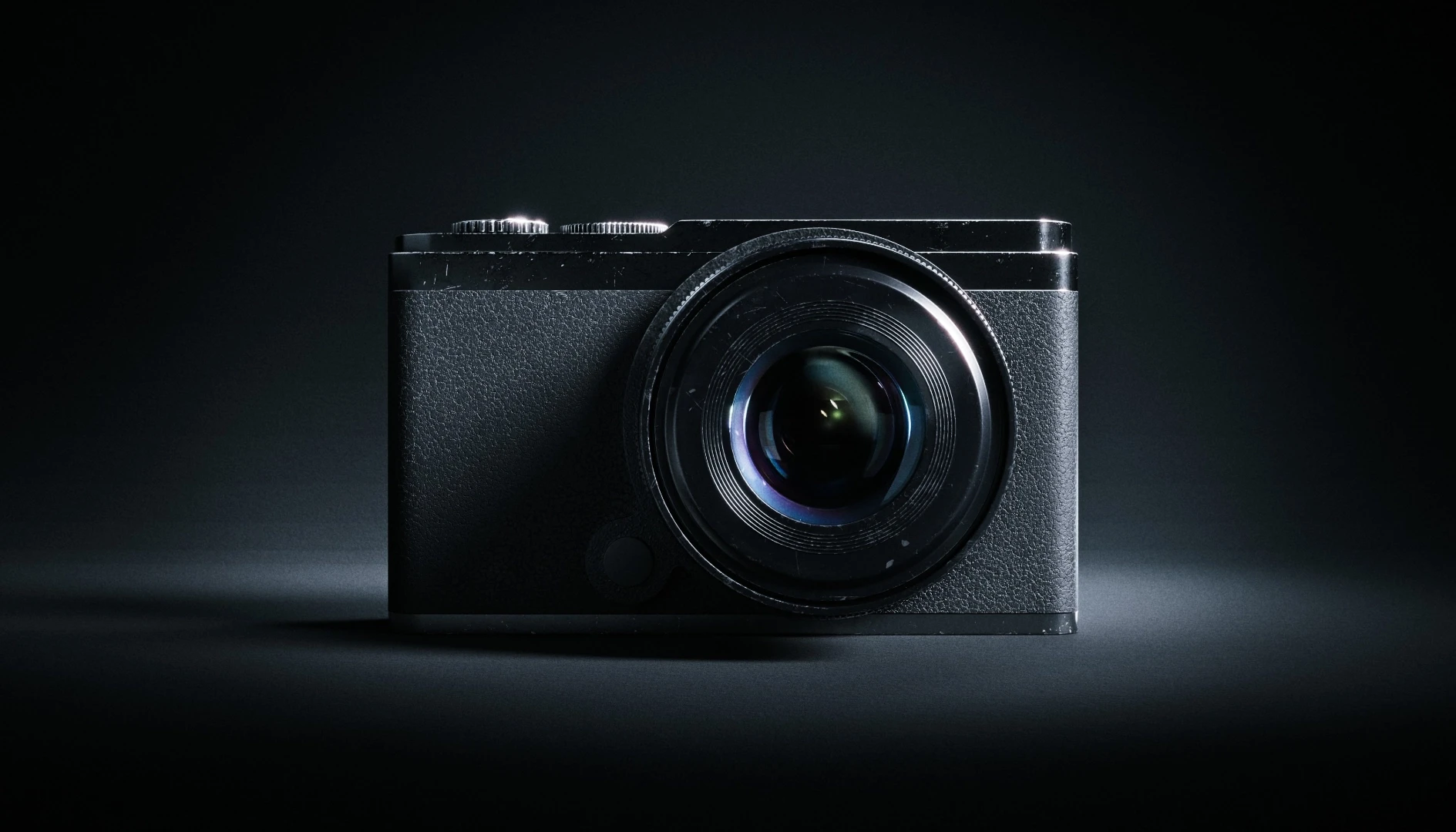
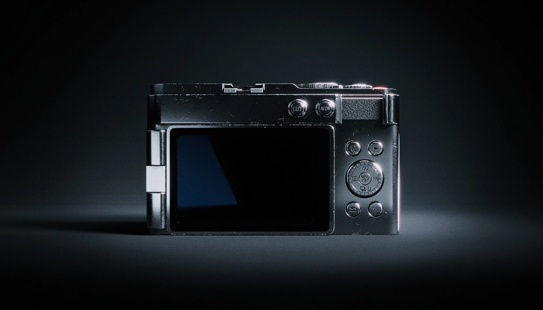
The first scene was inspired by commercial product photography. I created both a front view, which highlighted the lens, and a rear view, which showed the display and controls.
The lighting setup was fairly straightforward. I used a large soft key light, a subtle fill light and a rim light to separate the subject from the background. I also used a curved studio backdrop to create a clean, seamless look. I also used a few reflection panels to better control the lighting in darker areas.
I spent most of my time refining the position of the lights to achieve the desired reflections. Glass and metal can quickly appear dull if the highlights are not shaped correctly, so I experimented with the size, distance and position of the lights until the image looked more natural. Even moving a light or rotating the camera by just a few centimeters or degrees often made a surprisingly big difference.
Scene 2 – A More Natural Environment
For the second render, I wanted to create a scene that looked more like a real photograph. I placed the camera on a wooden desk near a window and added a few simple props to make the scene feel more lived in, including a camera strap, some photo prints, an index card and a pencil.
Lighting this scene presented a different challenge. Rather than creating a polished studio look, I aimed for soft daylight with realistic shadows and natural reflections. I used a neutral HDRI for the ambient lighting and a large window light to provide direction.
What I Learned
This project reminded me of the significant impact that small lighting adjustments can have. Often, a slight change in the size, position or angle of the light produced a much bigger improvement than simply adding more lights.
I also gained a much better understanding of shadows and reflections. These are just as important as the lights themselves, helping to communicate the shape, material and quality of an object.
In terms of compositing, I found that subtle color grading and gentle contrast adjustments were usually all that was needed.
Most importantly, I was reminded that working within constraints can make learning easier. By limiting the project to one week and keeping the model relatively simple, I was able to spend far more time experimenting, iterating and improving the skills I wanted to develop.